


Tips & Guides
Maximizing the Power of Google Looker Studio: Best Practices for Creating Impactful Reports
Aug 15, 2023
4 min read
.png)
Google Looker Studio is a powerful data visualization and reporting tool that empowers businesses to gain valuable insights from their data. With its user-friendly interface and robust features, Looker Studio enables users to create visually stunning and interactive reports. However, to harness the full potential of Looker Studio, it's essential to follow best practices when creating new reports. In this article, we will explore some key tips, strategies and key features to optimize your report creation process ensuring impactful results.
Creating Reports with Clarity and Purpose
Before diving into report creation, it is crucial to clearly define your objectives. Ask yourself: What insights are you seeking to uncover? Who are the primary stakeholders that will benefit from your findings? By establishing a clear purpose for your report, you can ensure that your visualizations align with your business goals and effectively communicate the intended message with remarkable impact.
Optimizing Report Structure for Enhanced Readability
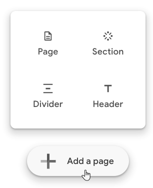
Unlocking the true potential of your report starts with optimizing its structure for enhanced readability. Start by strategically identifying the pages of your report and carefully curating the content for each page. Looker Studio offers various options for a clear structure. Implement Dividers between your pages to set distinct boundaries between pages and leverage Sections to group pages with related content. By mastering report structure, you effortlessly guide your audience through a captivating narrative, ensuring maximum comprehension and impact.
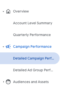
Use icons in your sections to enhance the readability and comprehension of your report.
Visualizing Insights: Choosing the Right Graphs and Charts
With Looker Studio’s expansive toolkit, a wide array of visualization options await, ranging from simple bar and line charts to the captivating complexity of heatmaps and scatter plots. Before diving into creating intricate visualizations, consider if existing graphs can effectively interpret the information at hand. For example, a bullet chart can accurately represent a metrics target achievement replacing detailed tables with multiple columns and calculated fields.
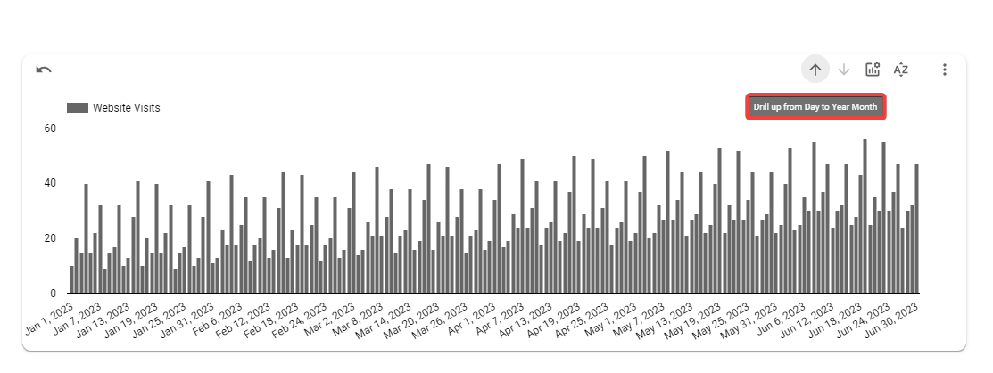
Avoid overloading your report with unnecessary visualizations that may overwhelm your audience, and also cause increased loading times, ruining the overall user experience. Looker Studio provides the tools to drill down and zoom in on tables and graphs, unveiling hidden layers of detail. By skillfully navigating the visual landscape, you unlock insights with remarkable clarity, ensuring your audience remains captivated and informed.
Optimizing Performance: Unleashing the Speed and Efficiency of Looker Studio
Efficient report performance is crucial for a seamless user experience. Take advantage of Looker's data modeling capabilities to create performant views and explore query optimization techniques.
Apply filters, aggregates, and data caching strategically to minimize query load times. With Looker Studio’s Data Extraction tool, you can extract a subset of your datasource, apply filters and date ranges and use that as a connection to your graphs and charts.
Additionally, consider the volume of data displayed in each visualization to avoid overwhelming the system. Optimizing report performance will enhance user engagement and encourage exploration of your data, igniting a realm of boundless possibilities.
Maintaining Consistent Styling: Elevating the Look and Feel of Your Reports
Consistency in report styling is essential for a professional and cohesive look. Establish a standardized color palette, typography, and layout that aligns with your brand identity or visual guidelines.
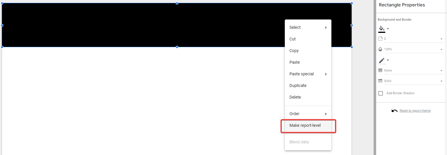
You can customize a single page of your report and then apply the layout in the entire report by making each object report-level.
Apply consistent formatting across all visualizations, including titles, axis labels, legends, and tooltips.
The dimension value color map, helps you define and customize the colours of the dimensions used in various charts across your report.
Adhering to a unified style guide will not only enhance the aesthetics of your reports but also contribute to a better user experience.
Controlling Report Changes: Publishing and Versioning in Looker Studio
The report publishing option in Looker Studio allows you to control when a change will be available in your report. This is a powerful feature that helps you review and make changes in your report without affecting the version that your audience views. You can enable this option by going to the File menu and selecting “Publishing settings”.
In the version History you can see all the published versions of your report, where you can name them so they can be easily retrieved.
Glossary for Clarity
Taking the time to offer explicit instructions to your audience on how to effectively interpret a report is essential for ensuring a clear comprehension of its contents. This step is particularly crucial as it enables you to establish concise definitions for the diverse metrics and dimensions employed throughout the report. By including this information in a dedicated section, you provide your audience with the necessary context to navigate and comprehend the report accurately.
Testing and Iteration: Enhancing Reports through Feedback and Updates
Continuous testing and iteration are key to creating impactful reports. Solicit feedback from your intended audience and stakeholders to identify areas for improvement. Test your reports on different devices and screen sizes to ensure responsiveness and optimal viewing experience. Regularly revisit and update your reports as new data becomes available or business needs evolve. Embracing an iterative approach will help you refine your reports over time and deliver greater value to your users.
Crafting Compelling Reports in Google Looker Studio: Unleashing the Power of Visualization and Data-Driven Decision-Making
Creating compelling reports in Google Looker Studio requires careful planning, thoughtful design choices, and a deep understanding of your data and audience. With every report, you have the power to ignite a revolution of informed choices, driving your organization to unprecedented heights. Embrace the power of Google Looker Studio, and let your data-driven narratives shape the future of your endeavors.


Similar posts
Read more posts from the same author!
Start your 30-day free trial
Never miss a metric that matters.


No credit card required
Cancel anytime
© 2023 Baresquare | All rights reserved.


