


Tips & Guides
Effective Data Storytelling: Unleashing Insights for Informed Decision-Making
Jun 28, 2023
6 min read

In today's data-driven world, organizations and individuals are faced with the challenge of collecting vast amounts of data from diverse sources. However, data alone does not communicate insights, knowledge, or actions. That's where the art of data storytelling comes into play. It has become a crucial skill for professionals striving to communicate complex information in a simple, effective way empowering businesses to make better decisions. When it specifically comes to web data, businesses have the opportunity to gain deeper insights into their online presence, analyze user behavior, and optimize their strategies accordingly.
Achieving this requires a series of essential steps, ranging, from meticulous data collection and organization to presenting the findings in a visually engaging way. Throughout this article, we will delve into these steps, providing valuable insights and suggesting powerful tools that can elevate the overall data analysis process. By embracing the art of data storytelling and harnessing the potential of these tools, businesses can unlock the true value of their data and gain a competitive edge in today's dynamic landscape. So, let's embark on this journey together and discover how to transform raw data into compelling narratives that drive impactful decision-making.
Step 1. Data Collection
Data collection is the first step in the digital analytics process. It involves the raw data gathering from various sources to gain insights and make informed decisions. Enterprises rely on effective data collection strategies to understand customer behavior, track website or campaign performance, and measure the success of their digital efforts. There are various tools available to aid in data collection.

- In web analytics, tools like Google Analytics or Adobe Analytics, and Mixpanel are widely used to track website traffic, user engagement, and conversions.
- For social media analytics, platforms like Sprout Social, Hootsuite, and Khoros provide comprehensive data collection capabilities for tracking social media metrics, audience engagement, and campaign performance.
- When it comes to email analytics, tools such as Marketo, Salesforce and Mailchimp offer data collection features to track email open rates, click-through rates, and subscriber behavior.
Selecting the most appropriate tools tailored to the specific needs of each category is crucial to ensure accurate and comprehensive data collection for meaningful analysis. By employing the right tools, businesses can unlock valuable insights and leverage them to drive strategic decision-making.
Step 2. Data Preparation
Once the data has been collected, it needs to be prepared for analysis by performing cleaning, transforming, and organizing raw data to ensure its accuracy and usability. Several tools are commonly used in this step, including Excel, Google Sheets, and Power BI, along with other alternatives.
- Excel is a widely used spreadsheet software that offers robust data manipulation capabilities. It allows users to perform functions like sorting, filtering, and formatting to clean and organize data.
- Google Sheets, a cloud-based spreadsheet tool, provides similar functionalities with the added advantage of collaboration and real-time sharing. It allows multiple users to work on the same dataset simultaneously, enhancing teamwork and efficiency.
- Power BI, on the other hand, offers advanced data preparation capabilities with features like data modeling, merging and appending data, and applying transformations through its Power Query Editor.
- Supermetrics offers a range of features that enable users to gather data from various sources, such as web analytics platforms, social media platforms, advertising platforms, and more. With Supermetrics, users can extract data, apply filters and transformations, and merge data from different sources into a unified dataset. This allows for comprehensive data cleaning and transformation, ensuring the accuracy and integrity of the data.
The choice of tools depends on the specific requirements and complexity of the data at hand. Users can select the most suitable tool or a combination of tools to efficiently prepare their data for analysis, setting the foundation for meaningful insights and informed decision-making.
Step 3. Data Processing
Data processing involves analyzing the collected data to uncover meaningful insights. During this step, errors and inconsistencies are identified and corrected, missing values are handled, and data is structured in a way that enables efficient analysis. This step also involves applying statistical techniques, mathematical models, algorithms, or other data manipulation methods to derive meaningful patterns, trends, or relationships from the data.

- One powerful tool for data processing is Google Cloud Platform (GCP). GCP offers a comprehensive suite of services and tools that enable efficient and scalable data processing. For example, Google BigQuery provides a fully-managed and highly-scalable data warehouse solution, allowing users to run fast SQL queries on large datasets.
- Furthermore, Python and R offer powerful libraries and frameworks for data analysis, statistical modeling, and machine learning programming language.
These tools provide a range of options to handle data processing tasks effectively, enabling organizations to derive valuable insights from their data. The selection depends on the specific requirements and complexity of the data at hand. Users can select the most suitable tool or a combination of tools to efficiently prepare their data for analysis, setting the foundation for meaningful insights and informed decision-making
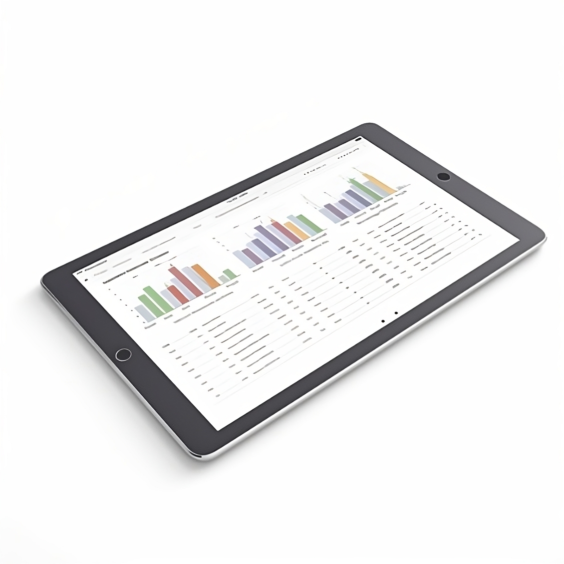
Step 4. Data Visualization
Data visualization is a crucial aspect of data analysis that helps to uncover trends and insights from raw data. There are several powerful tools available providing a range of features and functionalities to transform complex data into visually appealing and easily understandable representations.

- Looker Studio, a free web-based tool by Google, provides a user-friendly interface and a wide range of customizable visualization options. It allows users to create interactive reports and dashboards by connecting to various data sources.
- Tableau, on the other hand, is a leading data visualization and business intelligence tool that offers advanced analytics capabilities. It enables users to create visually stunning and interactive visualizations, dashboards, and maps. With its intuitive drag-and-drop interface, Tableau allows users to explore data from different angles and gain deeper insights.
- Power BI, developed by Microsoft, is another popular tool known for its robust data visualization capabilities. It offers a comprehensive suite of visualization options and supports seamless integration with other Microsoft products. Power BI enables users to create dynamic dashboards, reports, and interactive visualizations that can be shared with stakeholders.
These tools allow you to customize visualizations, add filters, and create dynamic reports that enhance the storytelling aspect of data presentation, aiding in better decision-making and understanding of complex information. The choice of data visualization tool depends on factors such as the specific requirements, data sources, and the level of interactivity and customization desired.
Step 5. Data Storytelling
Data storytelling is the final step in the process, where insights and findings are communicated in a compelling and impactful way. It involves presenting data in a narrative format that resonates with the audience and helps them understand the key messages and takeaways. Several tools can be used to enhance the effectiveness of data storytelling.
- The most popular tools are Microsoft PowerPoint and Google Slides, which allow users to create visually appealing slide presentations with data visualizations, charts, and narratives, providing various customization options to tailor the storytelling experience to the specific audience they are addressing.
- Another tool is Canva, which is primarily known for its graphic design capabilities, but also offers a range of features that can be leveraged to create visually compelling and engaging data-driven presentations. With its intuitive drag-and-drop interface and extensive library of pre-designed templates, Canva allows users to easily incorporate data visualizations, charts, and infographics into their storytelling materials. The platform offers a diverse selection of customizable elements, such as fonts, colors, and shapes, enabling users to tailor their data presentations to match their brand identity or desired style. Additionally, Canva provides the flexibility to import data from various sources, making it convenient to integrate real-time or updated data into the visual materials. Users can also collaborate with team members in real-time, making it a valuable tool for collaborative data storytelling. Whether creating engaging social media posts, interactive presentations, or informative infographics, Canva provides the tools and capabilities to transform data into visually appealing and impactful storytelling assets.
The choice of tool for data storytelling ultimately depends on various factors, including the complexity of the story being told and the desired level of interactivity with the audience. By leveraging the capabilities of these tools, data storytellers can effectively communicate their insights, engage their audience in a visually compelling manner, and inspire action.
Conclusion
In conclusion, mastering the art of effective data storytelling is a crucial skill in the field of data analysis. It allows us to move beyond mere numbers and present insights in a way that captivates and influences the audience. By employing a strategic approach that includes data collection, preparation, processing, visualization, and storytelling, we can transform raw data into impactful narratives that drive decision-making and spur action. Throughout this article, we have explored various tools and apps that can assist us in each step of the storytelling process. Each tool brings its own unique set of features and capabilities empowering us to enhance the storytelling experience.
By harnessing the power of effective data storytelling, we can unlock the full potential of our data and make a lasting impact in our organizations and beyond. As data-driven professionals, we have the opportunity to go beyond the mere dissemination of information and truly engage our audience, inspiring them to embrace data-driven decision-making and drive positive change. So, let us embrace the art of data storytelling and unleash the true power of our data to shape a brighter future.


Similar posts
Read more posts from the same author!

Start your 30-day free trial
Never miss a metric that matters.


No credit card required
Cancel anytime
© 2023 Baresquare | All rights reserved.


